Hospitality · Kiosk system
Two footprints, two material languages, one identity — a kiosk built to repeat without repeating itself.
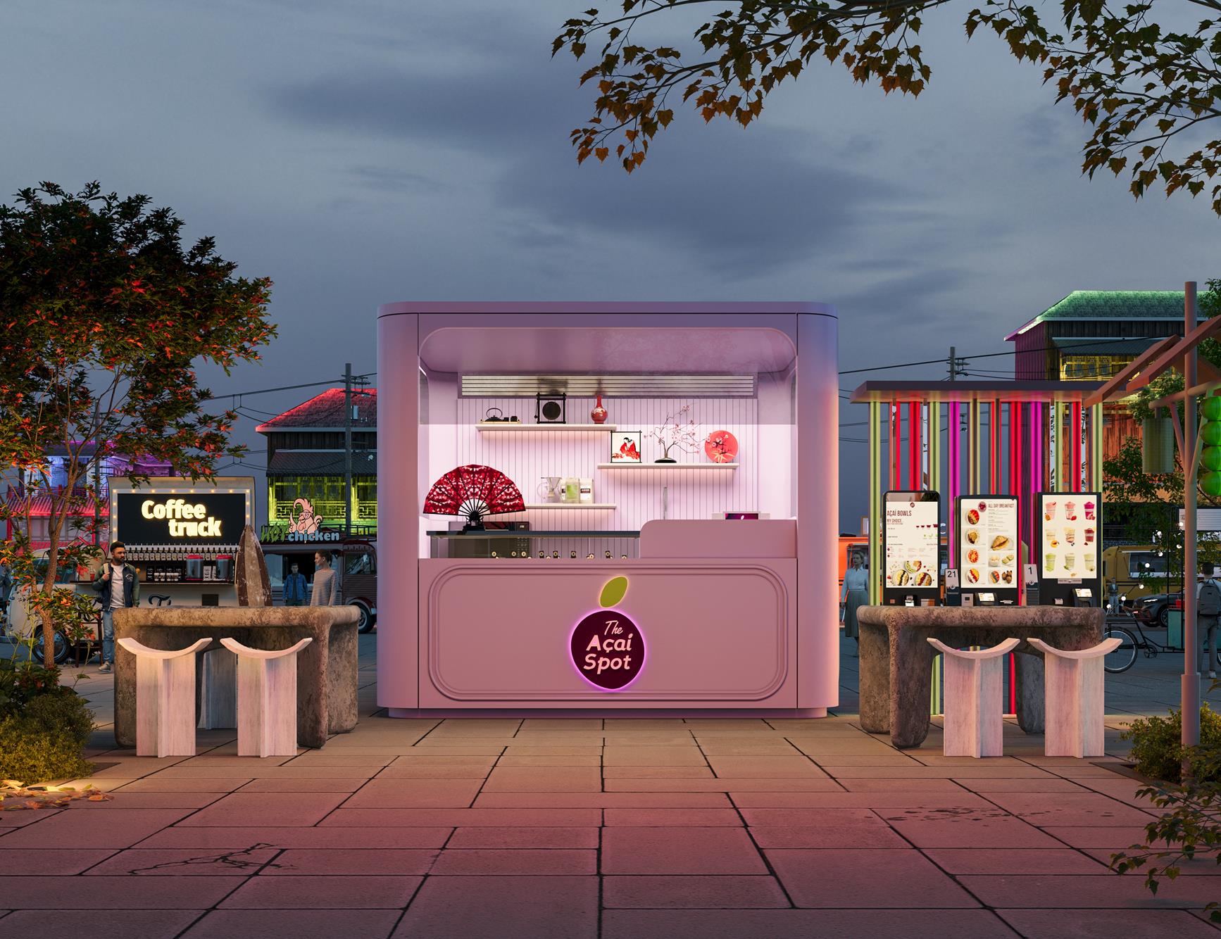
The Açaí Spot was drawn as a family rather than a single unit. Two footprints — a compact service counter and a larger covered pavilion — share one palette, one set of radii and one piece of hardware: a halo-lit medallion that reads from the far end of a concourse. Each format resolves on its own terms, so the brand can land indoors or outdoors without being redrawn every time.
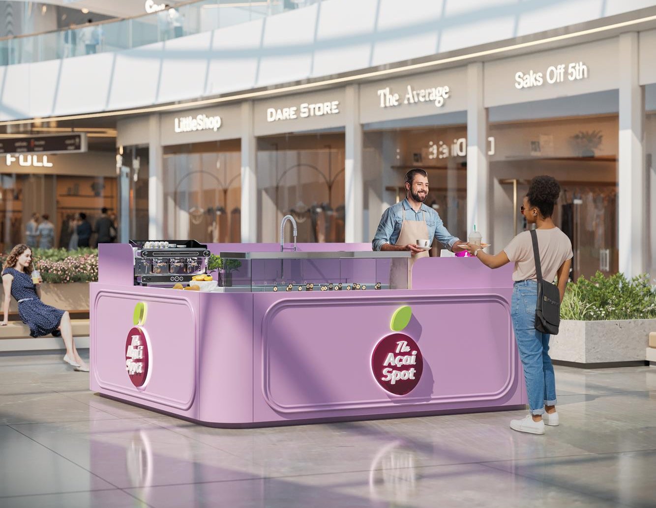
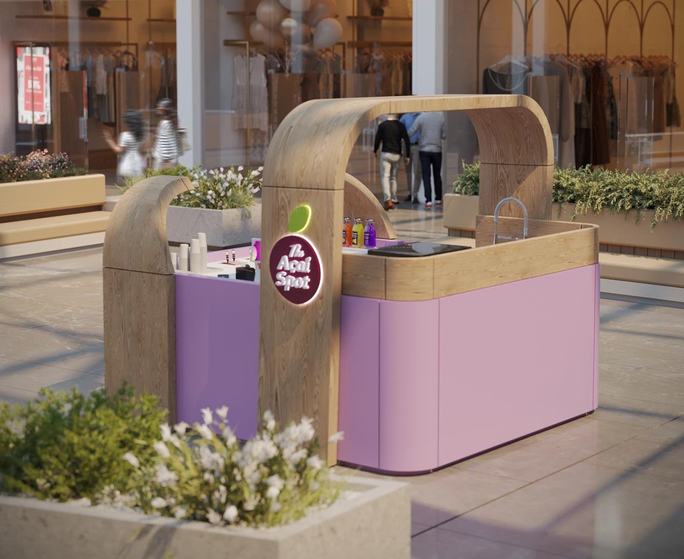
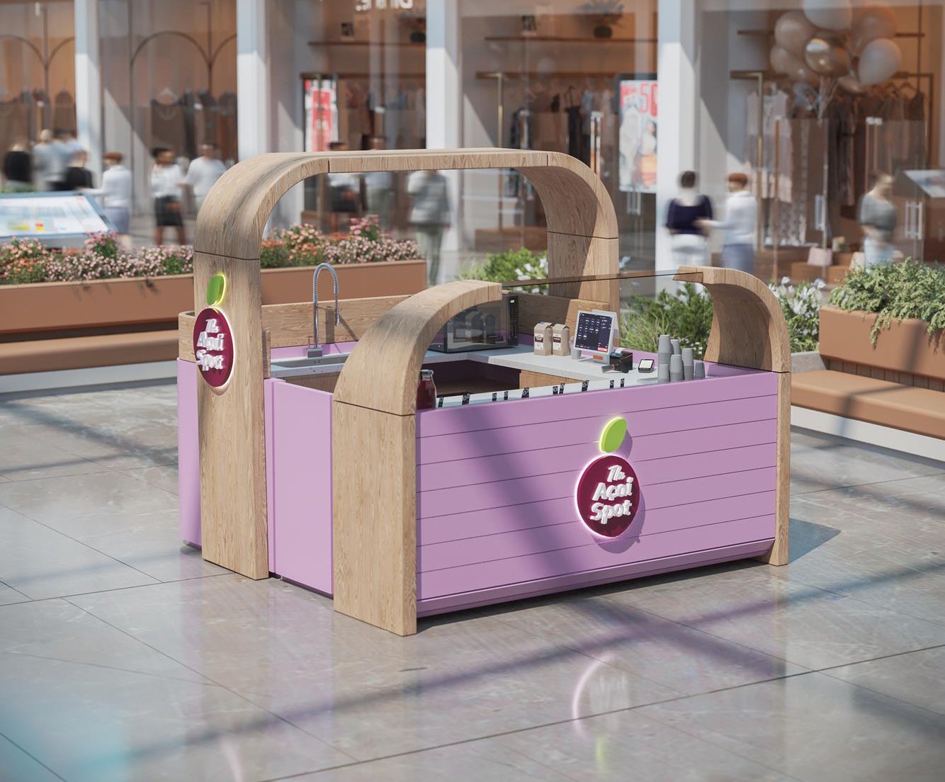
The compact format is open on more than one side, putting preparation in view rather than behind a screen. Espresso sits at one end, a chilled topping well runs the length of the servery, and the sink and prep zone tuck behind the raised lip of the counter. Nothing is concealed, and nothing spills into the walkway — the whole operation is held inside a footprint small enough to sit between two planters.
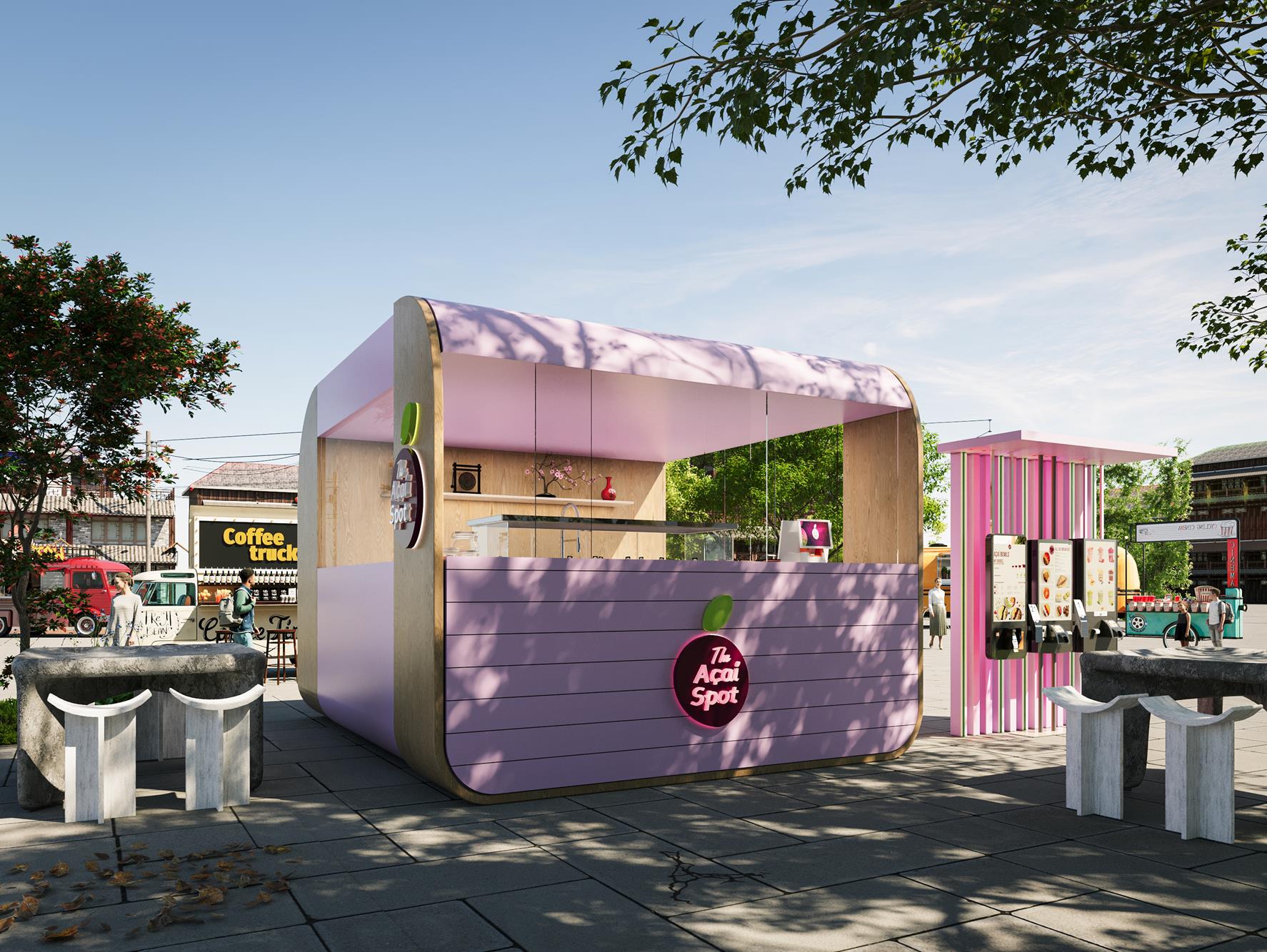
The larger format closes the composition into a room. A deep canopy folds down into the body of the kiosk to give shade, shelter and a soft ceiling of reflected colour, while the rear wall turns into display — shelves for objects, seasonal props and stock. Around it, low stone tables and pale saddle stools extend the kiosk outward, so it becomes a place to stay rather than a place to pass.
Two material treatments share the same geometry. The first is monolithic: lilac solid surface, softly radiused panels, the medallion floating on a recessed field, everything lit from within. The second introduces light oak — arched timber portals frame the counter and carry the roof, warming the lilac and giving the unit a structure that can be read at a glance. Both are set out to the same radii, so a site can take either without the family breaking.
Read at fifty metres,
resolved at fifty centimetres.
A kiosk has to work twice — as a mark across a crowded floor, and as a working surface an arm’s length away. The system was drawn so that neither reading is a compromise for the other.